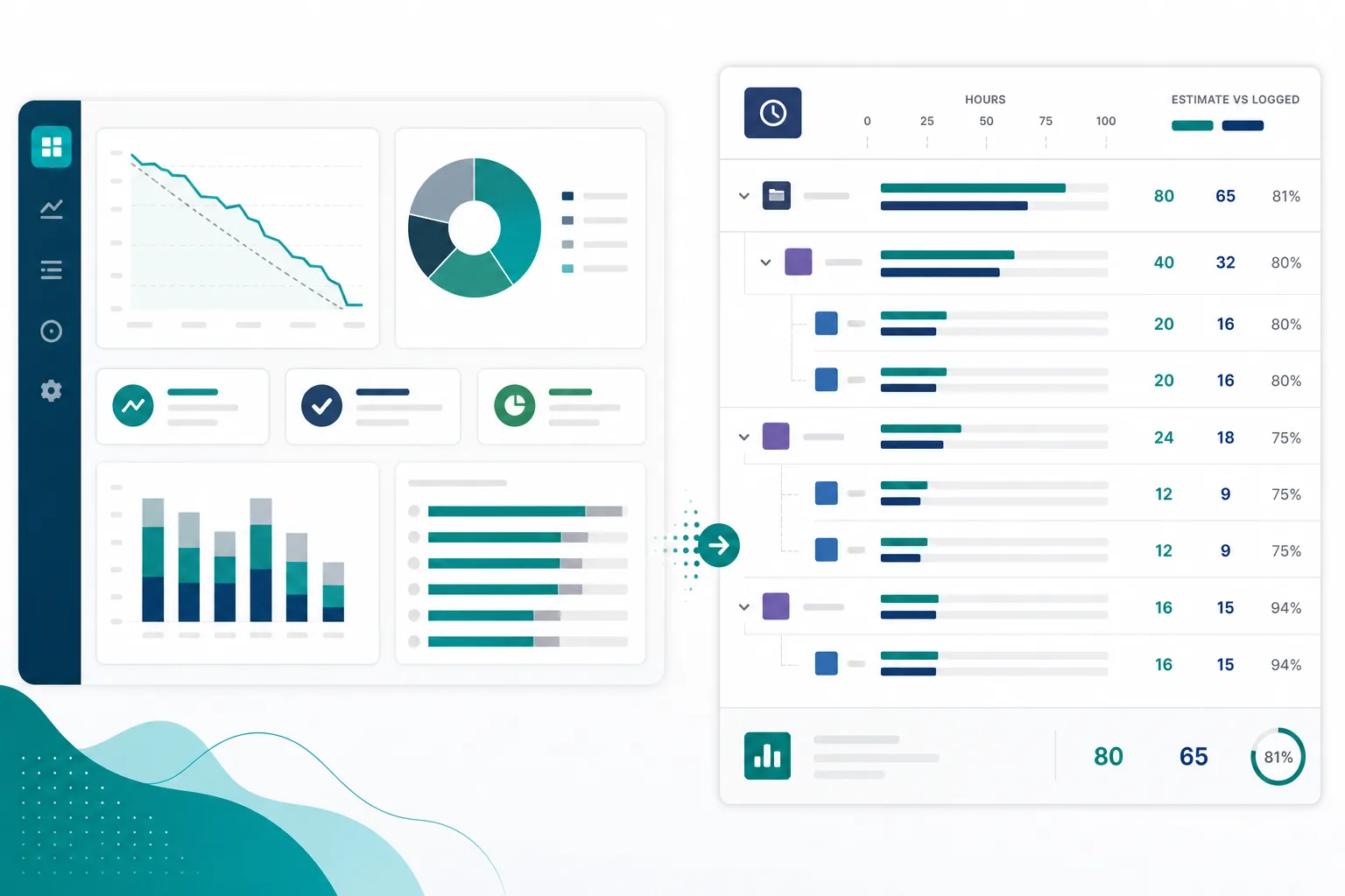
The awkward steering update is the one where the Jira dashboard time tracking view looks healthy and the hours story still falls apart.
The delivery lead opens the team reporting dashboard. Sprint Health is green. Created vs Resolved trends look stable. The filter table shows work moving. Then a stakeholder asks the question everyone was hoping to avoid:
"Where did the hours go this sprint — and which epics or people drove the overrun?"
Someone starts clicking Jira dashboard gadgets. The burndown explains sprint shape, not variance by epic. The pie chart shows status mix, not logged time by assignee. The filter table breaks work down by two dimensions, but it does not roll up original estimate, time spent, remaining estimate, and the child issues behind the total.
That is the gap behind dashboard reporting. Dashboards are built for visibility. Stakeholder updates often need explainability.
Dashboards Answer "What Is Happening," Not Always "Why the Hours Moved"
Atlassian describes Jira dashboards as customizable pages made of gadgets. Users can create multiple dashboards and add gadgets for assignments, issues, and charts. Gadgets the viewer cannot access are hidden based on permissions.
That model is useful. A shared Jira reporting dashboard gives executives, product owners, and delivery leads the same snapshot of flow, backlog shape, and sprint health.
It is also a different job from answering:
"For this epic, sprint, assignee, or client slice, what did we estimate, what have we logged, what is left, and which child issues explain the variance?"
Those questions are related. They are not the same report.
What Dashboard Gadgets Help With
Atlassian's dashboard gadget documentation lists built-in gadgets including Pie Chart, Created vs Resolved, Resolution Time, Road Map, Sprint Health, Sprint Burndown, Time Since Work Items, Time to First Response, and Two Dimensional Filter Statistics. Marketplace apps can add more.
For a project manager building stakeholder visibility, several gadget types matter.
Sprint and flow gadgets
Sprint Health and Sprint Burndown gadgets connect dashboard viewers to board-scoped sprint reporting. They help teams see whether a sprint is on track, whether scope changed, and how remaining work is trending.
Atlassian's sprint report documentation frames the sprint report as useful for retrospectives and mid-sprint checks. That is real value.
But the same documentation notes constraints: the sprint report is board-specific, and estimates on subtasks are not included. If your team logs time on subtasks and estimates at mixed levels, a sprint gadget may show a clean sprint story while the time story lives elsewhere.
Count and trend gadgets
Created vs Resolved, Pie Chart, and similar gadgets summarize volume and status movement. They answer questions like "Are we closing more than we create?" or "What share of work is blocked?"
Those are executive-friendly visibility charts. They do not, by themselves, produce an hours explanation a stakeholder can audit.
Filter-based tabular gadgets
The Two Dimensional Filter Statistics gadget displays tabular data based on a saved filter. That is one of the closest native dashboard tools for custom reporting.
It helps when the question is dimensional — for example assignee vs status or priority vs component. Depending on columns and filter setup, it may surface time-related fields for individual rows.
It still does not automatically produce a hierarchy rollup with variance explanation:
- Sum original estimate across an epic's children
- Sum logged time including subtasks
- Show remaining estimate and variance against baseline
- List the child issues that explain most of the overrun
Document the saved filter on the dashboard. If nobody owns the filter rules, the gadget becomes a private reporting shortcut.
Time-oriented gadgets that are not worklog rollups
Resolution Time and Time Since Work Items measure durations in workflow or calendar terms. They can surface aging and responsiveness.
They are not the same as a Jira time rollup dashboard that shows estimate vs logged vs remaining across a custom scope.
The Question Your Dashboard Was Not Built to Answer
Most recurring stakeholder questions about hours need more than one chart. Separate these pieces before you pick a gadget:
- Scope: which epic, sprint, project, filter, or assignee slice counts
- Original estimate or approved baseline
- Logged time on the work that counts
- Remaining estimate
- Variance against baseline
- Breakdown: child issues or people that explain the variance
Imagine an epic estimated at 80 hours on the parent story. Developers log on subtasks. QA logs on a bug linked to the epic. By mid-sprint, the dashboard burndown looks acceptable, but the stakeholder wants the epic total.
Jira stores much of that data on work items. Atlassian's time tracking documentation says the time tracking panel shows logged time and remaining time, and that teams may estimate with Original estimate, story points, work item count, or custom methods depending on setup.
The gap appears when nobody logs time on the container the stakeholder is looking at. Teams log on stories, tasks, bugs, and subtasks. Epics and dashboard aggregates may look empty or incomplete even while work is happening underneath.
Atlassian also documents that work items with more than 100 child work items cannot include those children in time tracking in some native contexts. That is another reason to avoid treating one dashboard gadget as the full hours answer for large epics.
Assignee and sprint slices
Assignee questions add another layer. A filter gadget can show "how many issues does Alex have in progress?" more easily than "how many hours did Alex log this sprint under epics A and B, including subtasks, and how does that compare to estimate?"
Sprint slices have the same shape. A sprint burndown gadget explains the sprint. It does not always explain cross-sprint epic budget or client-facing totals.
Status Visibility Is Not the Same as Explainable Budget
This distinction matters for admins choosing gadgets.
A dashboard can show:
- more issues in review than last week
- sprint burndown flattening near the end
- blocked work rising in one component
- resolution time increasing for one team
That is visibility. It helps managers notice problems early.
Explainable budget reporting needs something else:
- a current total that matches the stakeholder's scope rules
- inclusion rules managers can audit (subtasks, done work, moved issues)
- variance tied to named child work
- an answer that stays current after the meeting ends
When a dashboard only shows status shape, the project manager still exports search results or rebuilds a spreadsheet to explain the number on the slide.
Native Paths That Get Closer — and Their Limits
Before adding Marketplace gadgets, check whether native Jira already answers part of the question.
Board and epic reports
Jira documents multiple report types including epic burndown, epic report, velocity, and sprint report. Some teams link these reports from dashboard gadgets or Confluence pages.
Epic-oriented reports help when the question is epic-scoped and the team lives on one board. They are weaker when reporting spans multiple boards, mixes subtask-heavy delivery, or needs assignee-level hour breakdowns outside sprint boundaries.
Two Dimensional Filter Statistics on a dashboard
If the stakeholder question is tabular and filter-based, configure a saved filter carefully and use the two-dimensional gadget. Write down the JQL, issue types, and status rules on the dashboard description or a linked runbook.
If the question requires summing time fields across parents and children with variance, expect to supplement the gadget with export work unless a rollup tool is in place.
Jira Plans rollups
Jira Cloud Premium and Enterprise include advanced planning features. Atlassian documents that plan estimates can roll up from child work items and change as time is logged.
That can help planning teams already living in Plans. It is not automatically the same as a simple stakeholder dashboard for "hours by epic this month" on every Jira tier.
Search export when gadgets stop short
When dashboards and gadgets stop short, managers export. Atlassian supports exporting search results to CSV, Google Sheets, Microsoft Excel, Word, XML, and form data.
That confirms spreadsheet workflows remain a supported fallback — and that the calculation often leaves the dashboard entirely.
When Your Dashboard Is Enough
Do not rebuild reporting that already works.
Native dashboard gadgets may be enough when:
- Stakeholders care about flow, aging, and status mix more than hour variance.
- The team reports from one Scrum board with consistent estimation rules.
- Subtasks are execution detail, not hidden budget commitments.
- Sprint gadgets match the real reporting scope.
- Epic and sprint questions stay inside one board filter.
- Hour questions are rare, ad hoc, and acceptable to answer with a one-off export.
In that case, improve filter ownership, gadget titles, and links to board reports before buying another tool.
What a Better Rollup View Should Provide
Treat this as a buyer checklist for time rollup gaps your dashboard does not cover.
A rollup view worth evaluating should show:
- original estimate and logged time together, not on separate pages
- remaining estimate and variance in the same view
- hierarchy: epic, parent, story, subtask, or filter root
- assignee or sprint breakdown when the stakeholder question requires it
- inclusion rules: subtasks, done issues, moved work, missing estimates
- permission-respecting visibility aligned with Jira worklog access
- current data without a manual export step before every meeting
- clean PDF or CSV export when the answer must leave Jira
If your dashboard stack cannot do that, keep the dashboard for visibility. Add a rollup layer for the hours conversation.
Questions to Ask Before Adding Gadgets or Rollup Apps
For dashboard changes
- Does this gadget answer a visibility question or a calculation question?
- Is the saved filter documented and owned by the team?
- Do board filters match the stakeholder scope?
- Are subtask estimates and worklogs included consistently?
- Can a second manager reproduce the same numbers?
- Does the gadget respect viewer permissions for sensitive worklogs?
For Marketplace dashboard or time gadgets
Marketplace listings add chart gadgets, time reports, and rollup panels. Capabilities vary. Trial against one recurring stakeholder question, not a demo filter.
Ask:
- Does the app roll up native Jira time fields or require a separate time system?
- Which hierarchy levels does it support: subtask, story, epic, project, filter?
- Can managers inspect the child breakdown behind a total?
- What Jira products and hosting models does the vendor publicly support?
- What permissions or scopes does the app request?
- Are there documented limits for large projects or deep hierarchies?
- Can it export a stakeholder-ready summary?
Atlassian's time tracking administration documentation notes that Marketplace apps can extend Jira's time tracking power. Treat that as a reason to evaluate carefully, not as proof any one app fits your dashboard story.
Where TimePillar Fits
TimePillar is Backlog Bridge's product for teams that need explainable time rollups inside Jira, not only on a dashboard wall.
It renders as a live rollup panel on the issue view — epic, project, or parent — rather than as a dashboard gadget. The use case is narrow: when a project manager opens the work item and needs estimate, logged time, variance, and child-work visibility without exporting rows first.
That complements dashboard gadgets. It does not replace sprint health charts or status trend widgets.
If your reporting dashboard looks fine in meetings but the hours explanation still happens in a spreadsheet afterward, that is the workflow to challenge first.
Build Dashboards for Visibility, Rollups for Explanation
Jira dashboards and gadgets remain the right layer for shared visibility. They help teams see flow, sprint shape, aging, and filter-based summaries.
They are a weak final layer when stakeholders ask where the hours went — by epic, parent, assignee, or sprint — and expect the child work behind the total.
Do not throw away the dashboard. Clarify which questions it owns. Put explainable time rollups where managers actually prepare the answer.
See how Jira worklog reports in TimePillar help teams bring estimate, logged time, variance, and child-issue rollups closer to the work — so the dashboard can show status and the hours story can stand on its own.